From chaos to clarity: Modernising Blue Nova’s EMS with design that works as hard as its engineers.
Role:
UX/UI Designer
Project Overview
The Blue Nova EMS redesign was a strategic initiative aimed at transforming a legacy system into a modern, intuitive, and scalable platform. The existing Engineering Management System was outdated, fragmented, and misaligned with how engineers actually operate—leading to inefficiencies . Our goal was clear: reimagine the EMS with a human-centred lens, streamline critical workflows, and build a design foundation that could evolve with the business.
My role
As the Product Designer, I collaborated closely with engineers, developers, and fellow designers to lead an end-to-end design process. This included conducting a comprehensive UX audit, running a heuristic evaluation to identify usability gaps, and translating insights into wireframes and interactive prototypes. To future-proof the experience, we also developed a design system from scratch—ensuring visual consistency, scalable components, and a cohesive user experience across the platform.
Challenge
The existing Engineering Management System (EMS) was outdated, fragmented, and difficult to navigate—resulting in workflow inefficiencies and low user satisfaction. Engineers struggled with inconsistent interfaces, unclear information architecture, and a lack of intuitive interactions that slowed down critical operations.
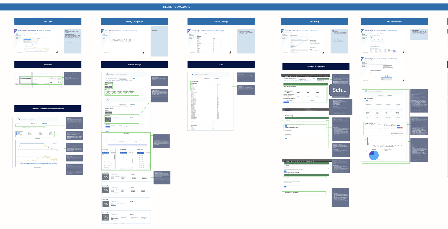
What made this project more complex was the initial lack of clarity around why a redesign was even necessary. Without a shared understanding across teams, we needed to ground the project in evidence. This led us to conduct a full UX audit and heuristic evaluation—laying a strategic foundation for the redesign and aligning stakeholders around tangible usability issues.
Design Process
To ensure the redesign was grounded in real user needs and scalable for future growth, we followed a structured, end-to-end design process:
UX Audit & Heuristic Evaluation
We started by evaluating the existing EMS against usability heuristics to identify pain points in navigation, information clarity, and visual consistency. This helped us diagnose root causes behind inefficiencies and prioritise redesign areas.
Stakeholder & User Interviews
We engaged engineers and system users to understand their day-to-day workflows, frustrations, and goals. This gave us insight into how the EMS needed to work for them, not the other way around.
Information Architecture Overhaul
Based on findings, we restructured the system’s navigation to reflect how engineers think and work—making it easier to find, input, and act on information quickly.
Wireframes & Prototypes
We built low-fidelity wireframes to map the new structure and test concepts early, then moved into high-fidelity prototypes for usability testing with actual users. Feedback loops were baked into every phase.Low-Fidelity Wireframes
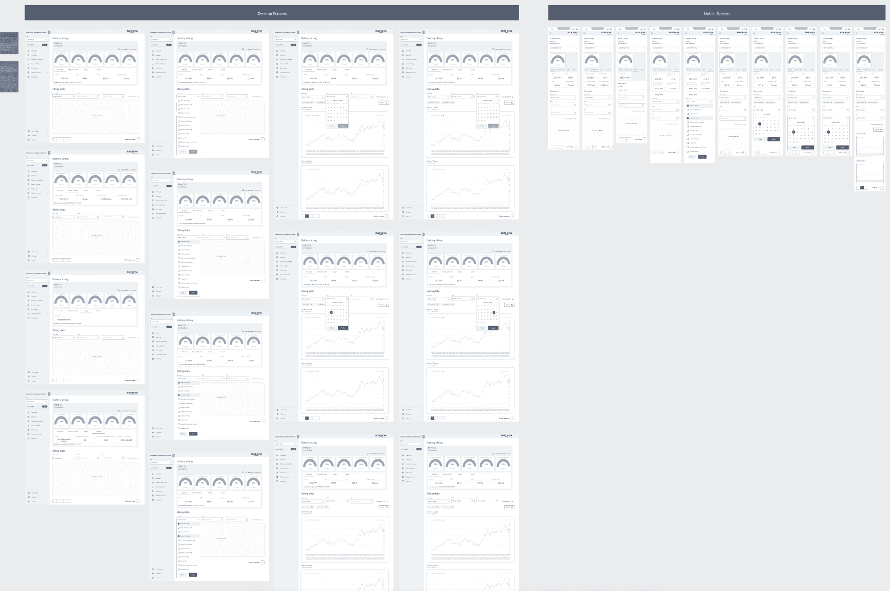
High Fidelity Wireframes
Design System Development
To create consistency across the platform, we built a robust design system from scratch—defining reusable components, layout rules, typography, and colour tokens. This would ensure a unified experience across current and future features.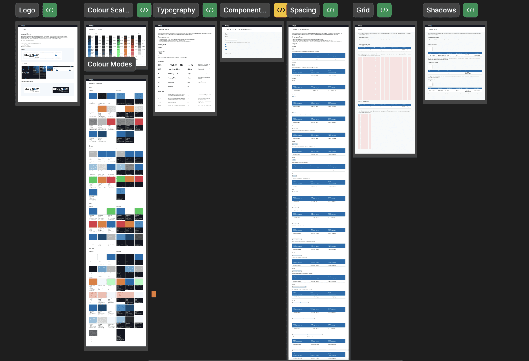
Solution
Our redesign of the Engineering Management System focused on clarity, usability, and future scalability—transforming it from a legacy tool into a modern, intuitive platform engineers could rely on daily.
Key improvements included:
A Modular, Scalable Interface
We introduced a clean, modular layout that could scale as the platform evolved. Information was prioritised based on usage frequency, reducing visual clutter and cognitive load.Workflow-Driven Navigation
Instead of forcing users to adapt to the system, we redesigned the navigation around engineers' natural workflows—streamlining task completion and data entry.Visual Hierarchy & Consistency
Through the newly built design system, we ensured consistency in interaction patterns, component behaviour, and visual language—creating trust and reducing confusion.Enhanced Data Visibility
We restructured complex dashboards to surface critical insights quickly. This helped engineers make decisions faster and reduced time spent searching for key metrics.
Mobile Responsiveness & Accessibility
We implemented responsive design principles to support engineers working across environments—ensuring functionality whether at a desk or on-site.
Lessons Learnt
1.Start with alignment—don’t assume urgency is obvious.
One of the biggest early hurdles was helping stakeholders understand why the EMS needed a redesign. Conducting a UX audit and heuristic evaluation gave us the evidence we needed to turn subjective frustrations into objective priorities—and align the team around a shared vision.
2. Designing for engineers means designing for precision.
Engineers value clarity, logic, and control. This project reminded me that great UX isn't always about delight—sometimes it's about reducing ambiguity, surfacing the right information at the right time, and removing unnecessary steps.
3. A design system isn’t just a UI toolkit—it’s an operational asset.
Creating the EMS design system from scratch not only helped standardize visual language but also enabled faster development cycles and reduced decision fatigue across the product team. It became a living guide for scaling both design and development.
4. Cross-functional collaboration turns insights into impact.
Working closely with engineering and development teams ensured that our designs were technically feasible and grounded in real-world usage. This collaboration was critical to delivering solutions that were both intuitive and implementable.